Thursday, May 8, 2008

Light Series 1 - April 2 and April 15


April 2nd

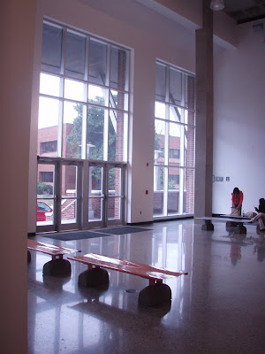
Today the sun is shining bright and filling the gallery with a large spread of light. This picture was taken at about 5:00pm. The sun has gone down a bit in the picture but all day it was really warm and inviting in the lobby space. And I literally mean warm! It seemed like it was about 10 degrees warmer in the lobby than it was anywhere else in the building. Probably even warmer than it was outside. There was not much of a glare which is what we usually find in this space with all of the glossy surfaces.
April 15th
Today was a little chilly and it made the lobby feel cool and uninviting. This picture was taken around 6:00 pm so the sun has gone down for the most part but you still see a nice glow coming in from the windows and casting a nice shadow on the concrete column. The illuminance of the glossy concrete floor also seemed like a body of water with the glare that we can't seem to get away from.

Wednesday, May 7, 2008

Lighting Final!


Light Series 4 - HID

A. This space is a middle school basketball gymnasium.
B. The purpose of this lighting is ambient lighting. It is used for large volume and tall ceiling types of places.
C. The luminaire is metal with a plastic covering. There are more than one HID's in the luminaires.
D. The effect of the light source in the space is a bright all over intensity spread to illuminate the surface of the court as a whole. The key is to have sufficient overlapping of light in order to reduce contrast and keep the court surface looking smooth.
E. The effect of the light on colors is somewhat reddish. The blues on the court look really muted and even greyed out. The reds in uniforms really stand out which is one good thing about having a cool color temperature.
F. The levels of illumination are appropriate. There is a nice spread of illumination across the court. Although there is a glare created from the luminaires on the floor which could be a problem from the basketball players concentration.
G. Observations and Recommendations:
  • Using a lower intensity light may reduce the glare from the luminaires on the basketball court.
  • Use some wall washing to reduce the contrast from the court to the walls to the ceiling. The ceiling seems the brightest area of all.
  • Maybe use some task lighting down where the judges and score keepers will be so they don't have to just rely on the ambient lighting from the HIDs.

Light Series 4 - Flourescent

A. This space is a kitchen which is attached to a laundry room and hallway.
B. The purpose of lighting is for ambient use. It lights the room as a whole.
C. The luminaires are recessed ceiling panels of fluorescent lighting. It hangs down a few inches from the finished ceiling and creates an overhead glow lighting up the whole kitchen.
D. The effect of the light source is clean and clear. It creates a nicely spread lighted work surface on the counters and center island.
E. The effect of light on colors is pretty accurate. There are mainly neutral colors in the kitchen so it isn't hard to establish one tone from another. The browns are still clear, as well as the beiges and blacks and whites.
F. The illumination level in the kitchen is appropriate. There are no harsh shadows or contrasts between the surface or work plane and cabinets. Although there is a little bit of a glare on the back cabinets which might have actually happened due to the flash in the camera.
G. Observations for improving the lighting environment:
  • Add some task lighting
  • Add some under cabinet lighting to reduce the small contrast made from the shadow of the upper cabinet.
  • Make the most of natural lighting.
  • Reduce the cabinet glare by either using a different finish on the wood or a lower intensity fluorescent.

Light Series 4 - Incandescent

A. This is a picture of a hotel room using incandescent lighting.
B. The purpose of the lighting is for task lighting (and maybe even accent lighting). Perhaps bedside reading, to create and a mood or feeling or a small light for navigation.
C. The luminaire is a table lamp and consists of a lamp shade and base. It mainly shines light downward and has a little bit of light that shines upward. There is a slight glow that permeates the shade too.
D. The effect of the light source creates a low light intimate mood setting. Because of the lamp shade it creates and interesting light pattern on the wall above and behind.
E. The effect of the light on different colors in the space creates a reddish tint on everything. The blue on the comforter almost looks grey-ish, brown. As you can see it also distorts some of the other colors too... but all of the reds look really bright and pop right off of the comforter.
F. The appropriateness of the illumination level is decent when combined with the overheard ambient lighting. Although when just the table lamps are used alone it creates too much contrast in the room and is uncomfortable to the eye.
G. Observations and Recommendations:
  • There seems to be a bit of a "hot spot" underneath the lamp... perhaps too harsh for reading. Maybe consider using a compact fluorescent or a lower intensity incandescent.
  • Use an incandescent that is closer to a white light instead of red since everything seems to have a funny reddish tint.
  • Use more ambient lighting to reduce the contrast between the luminaires.

Monday, March 17, 2008

Color Combinations Project


Light Series 3

Grocery Store - Light source seemed to be a cool flourescent hanging light fixture used throughout the space
Fabrics....
  • Red - Appeared very bright and definately drew your attention. I went near the meat section to see how the red meats would look and it definately had a great affect on these products. Obviously a good thing because it looked really juicy!
  • Yellow - Appeared bright, suprisingly not as bright as how the red was at grabbing your attention.
  • Green - Appeared somewhat flat and even slightly brownish. You had to look hard to see this but it didnt look the way it should.
  • Blue - Appeared very cool and refeshing. The cool flourescents probably helped amplify this.
Retail Store - I went to a jewelry store and the light looked like it had a red film in it. It was a suttle red but it was definately noticeable. The store specialized in sterling silver pieces with emerald green stones.
Fabrics.....
  • Red - The red seemed flat and blended in with the rest of the room. This was probably because of the red tinted lighting
  • Yellow - Appeared orange... and not a good orange.
  • Green- This color seemed to really pop out the most of all.
  • Blue- Appeared purple.. similar to the yellow, it was probably because of the light shining.
Residence - I stayed in my condo for this one. I have reccessed incandescent lighting. I also have a fan with a light kit attached and when i have the fan on the shadow from the blades have a somewhat annoying constantly moving circular shadow.
Fabrics....
  • Red - Appeared bright and definately popped. Energizing!
  • Yellow - Appeared almost grey/brownish. Almost depressing.
  • Green - Appeared brownish and flat. Held up next to my brown couch it seemed to blend in.
  • Blue - This color seemed somewhat grey and boring.
Library - The library had a low lighting that felt very intimate although it wasn't very effective for task lighting. I wonder if this was because they don't really want people sticking around to read and study. I couldn't figure out for definate what type of lighting but I was thinking a warm flourescent.
Fabrics....
  • Red - Appeared stationary and boring. Almost had a brownish feel to it.
  • Yellow - Appeared bright and cheerful. Other than my fabric I didn't see much yellow in the library.
  • Green - Appeared cool and refeshing.
  • Blue - Appeared intimate and cool similarly to the green.

Interesting Shadows


Here is a picture from my Spring Break trip to Virginia Beach. I was standing underneath a pier looking out to the ocean and I just had to take a picture. I loved the way the positive and negative space made the picture so dynamic and the way the shadows played along the water and sand from the pilings.

Light Series 1 - March 17th 2008

Today was a beautiful day and the sun was shinning bright. The space seems to be a bit brighter now too since the time change. The floor looked extra glossy today and the whole space felt warm even thought it wasnt. And it was also pretty cold outside too. I can understand the use of natural light to make a place feel warmer when it actually isn't as warm outside. It is a great technique and may even help with energy costs. I also noticed taht if you stood right near the windows, the natural light actually did feel really warm. However as you moved away from the windows it got a bit cooler although it wasn't very noticable.

Thursday, March 6, 2008

Light Series 2 - Retail Store

Here is a picture in the hallway of the Freedom Mall in Charlotte, NC. Instead of just going into one particular store and studying the light patterns I thought it would be more interesting to stand in the hallway and see how the circulation uses lighting. Also I would like to see how the stores use lighting to attract potential shoppers. First off the first few shops on the sides of the picure just use a boring red and orange neon sign. It attracts you but it is not very original. The sign on the right with the white glow and the dark letters are interesting. The contrast is what is most important. Also the directionality of the overhead lighting is nice and effective although somewhat boring too. It also has a bad glare as you can see on the ground. Recommendations could be several different things. Flourscents are godo for covering wide areas but it would be nice to create more interest like using a soft diffuse cove lighting along the sides of the hallways. Also, as stated before, the individual store signs could have maybe more colors and more contrast. The Gap has a great way of using a track lighting to highlight their sing. In addition they carry that theme throughout the store and uses it to emphasis particular outfits and new arrivals.

Light Series 2 - Art Gallery

Here is a picture from a small gallery in downtown Stafford, Va. This is a picture I was able to take in the lower level of the gallery. The other part of the gallery is right off the street and the passing cars create a horrible glare from the glass onto the exhibits. One of the only lighting patterns I have noticed from visiting this gallery is that there is track lighting where each painting/piece has its own spotlight. I think in many other circumstances this would work well however there is a glass and frame that protects the art. This glass creates a reflective property that bounces the light around too much making it hard to concentrate on the individual pieces. In addition, as you are walking the the space your own shadow gets in the way of the light. This could be because the ceiling is so low. The track lighting that is used is good for an art gallery because they are flexible. They can be arranged differently as new art comes in. Recommendations would be perhaps using a different type of light that doesnt have as much of a glare on reflective surfaces. Also I know there isn't much you can do about the height of the ceiling since there is another level about it but I was thinking a wallwashing uplight might make the space seem larger. The distracting shadows might not be as strong this way. I wasn't sure what was being used, I assumed it was an L.E.D. of some sort... the lady I asked didn't know either. The hallway crossbeams on the ceiling also create an interesting affect from the luminaires. This presents an opportunity to group particular pieces together between the beams or have more emphasis on one compared to another.

Light Series 2 - Restaurant


In this portion of the light series I analyzed the dining space in the upstairs of the Elliot University Center. The main pattern that I noticed is that the luminaires are hanging fixtures directly above the eating areas, tables and condiment/ food preparation areas. This task lighting is successful because it is suspended higher in the air so it isn't distracting when you are trying to eat and converse with the people around you. Restaurants that have the low hanging spot lamps get in the way of view and also have strange color rendering making the food look less appetizing. The higher lighting in the EUC is diffuse as it hits the right places. The other pattern I found was that the walls, which is where most of the circulation is through the space, have wall washing systems. This is somewhat successful as a way-finding device although there are a few recommendations. The top corners and edges of the spaces above the wall wash seem somewhate cave-like. The contrast is too saturated in some areas and not enough in other areas. Instead of just a downlight wall wash perhaps there could be a uplight too. This will help guide you eye around the space better. In addition perhaps use a better flourescent that seems a bit warmer than the cooler one. No matter how warm or cold it actually is the space it always seems cold and I think a warm light color tone could help this problem. Similar to the Stone building I also light the use of repetition in the lights. Also even better in the EUC there is a combination of many different lighting usage... wallwashing, recessed, and hanging luminaires!


Light Series 2 - Stone Building


The Stone building has such a great presence on UNCG campus. After analysing the lobby outside the main office it was somewhat anti-climatic. It was very dark and uninviting. The one hanging luminaire is not nearly sufficient for people entering. In addition there is such a strong contrast from the outside brightness to the inside darkness that it take a bit for you eyes to acclimate to the light. It can almost be disorienting. As you turn back around and look outside the daylight is so strong that it creates an uncomfortable glare on the glossy floor. A recommendation for this problem could be a change in floor material. Perhaps the glossiness enhances the glare. Also I would recommend more lights in the entrance so that the contrast from outside to inside isnt so stong. Or maybe the luminaire could be a omni-present light the fills the space instead of a direct spotlight like there is now. Here are a few more pictures of the proceeding hallways which seem to be a bit more successful! The overhead lighting are stronger and even provide a directionality aspect to the space. Also it creates a nice rhythm throught the repetition. I think the use of cove lighting is successful too.


Day Light Model


In our private vs public space we were really inspired by Le Corbusier and Alvar Alto's brilliant use of natural light in their buildings. Although the assignment was to create a "daylight box" we thought it would be more dynamic to use cuvilinear forms concave and convex. We wanted to see how this would diffuse the light as it flows through the small slits and hits the surfaces within the building. In addition the small vertical slits played an interesting role in our project. The light from the slits that were higher seemed to fade out (almost fuzzy edges) as they hit the ground and walkway surfaces. The light from the slits that were lower seemed to be more crisp and clear. Also my favorite part is as the sun is setting the effect that it has underneath the walkway/bench. It has a really interesting glow that is a neat way to have a natural "lighted path" giving the space directionality.


March 4th and 5th


March 5th and 6th


I have been noticing that as we are getting closer to sping time that the light in the space is starting to "feel" warmer. Not to mention the space is getting warmer, especially if you are standing right in the streaming sunlight. These two days were really beautiful so I wanted to capture the light from both days instead of just one. The only problem is that while standing in the sunlight (if you are facing it) it is really hard to see and even harder to concentrate. Today we presented our daylight models in the lobby and I noticed that the groups that were up presenting were squinting hard and trying to sheild themselves from the sun. There were several times that people had to stop and restart their sentences just because they were so distracted. I really wish that the designer took this into consideration since it is such a big mult-functional space where students present their hard work. Glare still seems to be a problem as the weeks go on.


Wednesday, February 20, 2008

Feb 18th -- Light Series 1


Finally a clear and sun shiny day! I wanted to focus on the ceiling in these pictures because it was interesting to see how much the natural light accentuated the

waffle ceilings. However there was a bit of a harsh glare that shined off from the metal HVAC systems. The mullions in the windows portrayed neat shadows on the right wall of the lobby area and the illuminance off the shiny floors made them look glassy.

Tuesday, February 12, 2008

Light Model -- Johanna, Jessica, Janel, Emily


In our light model we wanted to work with the idea of additive color mixing and spacial hierarchy. To achieve this we fastened colored plastic rectangles to string and meticulously placed them in specific areas of our light model. We tried to angle them so that perhaps a blue and a red would mix and you would see the different colors throughout the white inside. We also found that there were some areas that all three colors (red, blue and green) mixed and were able to create "white light." Creating hieirarchy was in the presice placement of these colored rectangles. The more condensed area seemed more important because the light source was placed there. The less condensed area wasn't as emphasized however we were still about to see the colored shadows and created an interesting backlighted affect. My favorite part of the light model was the movement and rhythm that was achieved by slightly touching the box and you could see (especially the green rectangles) all the colors move around and sway into different places of light.

Feb 1st and 5th, 2008 Lighting Series 1


Feb 1st... The lighting seemed to be a bit bright and hazy again in these pictures. Although it wasn't as hard to see as it was in the previous pictures from January. I didn't feel as thought I were struggling to focus as much as I was before. Perhaps it was because the glare from the glass windows and doors in the front lobby was not as dominant as before. Still showing a prominant glare but it wasn't as strong.


Feb 5th... Here we have another darker view of the day. (Picture taken at about 5:00pm) It was a clear sunny day but was not about to photograph until later so the contrast wasn't as strong as I would have liked to see. The glare on the shiny concrete floor was still present from the windows. Interesting to see how the people reacted to the space. No one one would turn towards the windows because the light that eminated from the outside were somewhat annoying. In this picture you can see the person facing away. The lighting does not seem to be working. It seems as though the architect wanted to make an impressive entrance to the building but paid little attention to what the light would do to the interior space. Almost the opposite feeling of "welcoming"


Jan 19, 2008 Lighting Series 1

These two pictures were taken at different times during the day. The day was somewhat overcast and cloudy so you couldn't tell much of a difference between morning and late afternoon. It was strange to see that the one taken in the morning seemed darker than the one taken in late afternoon. The first picture (taken at about 12:30 pm) has almost a cold and dusky type feeling whereas the second picture (taken at about 4:30) feels a bit warmer and brighter. It seems as though the luminance is stronger with deeper contrast later in the day... although again, the weather was not a clear sunny day.


Thursday, January 24, 2008

Test Post

Test Post for Lighting Class